

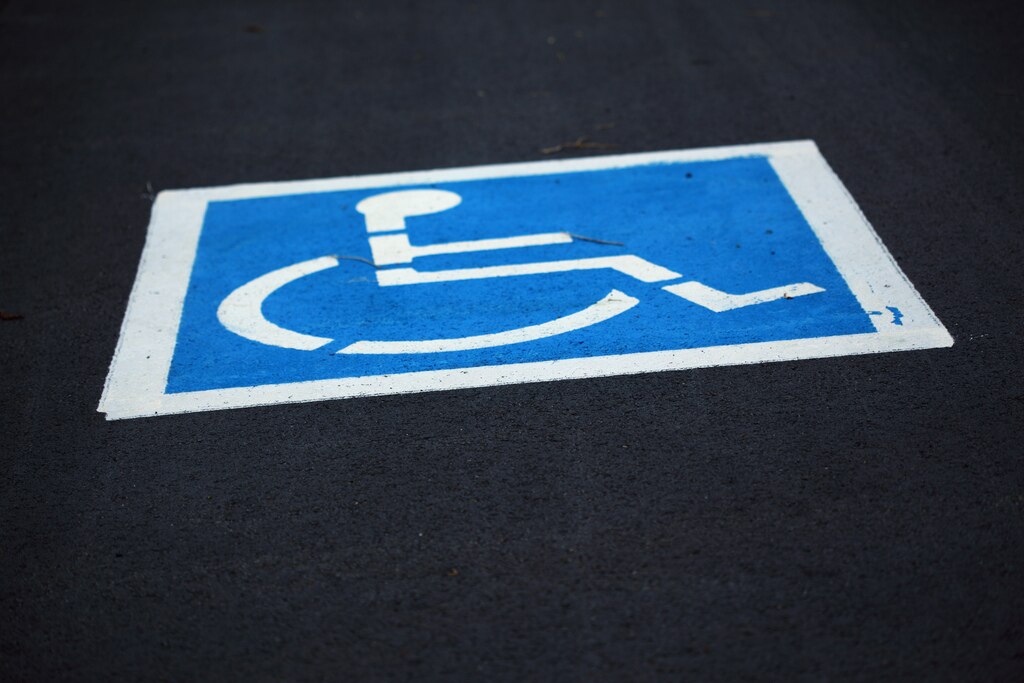
3 Factors To Know About The ADA And Handicap Signs
The ADA, standing for the American Disabilities Act, dictates all aspects about a handicap sign. This includes all areas ranging from production to final sign placement. Understanding these factors, and implementing them, is crucial to the overall success of any business.
1. ADA history
The ADA was developed in 1990 to assure equal rights for all disabled individuals, no matter what their physical or emotional capability. The law was originally implemented to improve accessibility for the visually-impaired, blind, and mobility-hindered population. The law promotes equal accessibility to all. It discusses in detail all aspects of signage including location, position, type-styles, universal symbols, and material construction.
All entities employing more than 10 people are required to understand, and abide by, ADA federal and state regulations. This includes placing wheel-chair accessible signs by building entrances, designated parking areas, and internal locations. All applicable firms must have clearly marked parking spaces set aside for both van access and handicap users. The law describes how many spots are required, based on the number of employees or traffic.
2. Updated in 2012
New federal ADA guidelines were implemented in March, 2012. These replaced all previous versions. Key areas of change include letter spacing, contrast, stroke width, and mounting height.
According to the new regulations, there must be at least 1/8-inch space between letters. The character height does not matter. The sans serif type-style is usually required for signs.
Contrast requirements are no longer in existence. Contrasts are still used, however, so consulting with a trained sign professional is recommended for optimum results. A non-glare finish must be used for both the background color and lettering. Signs must either have a dark background and light lettering, or a light background with dark-colored content. Professionally manufactured signs, like those done by Signs Direct, use a standard E.G.-reflective coating on an aluminum base.
The allowable font size is determined by the stroke width of an uppercase letter “I”. All letters used on the sign cannot be greater than 15% of the “I” height. Braille tactile characters must meet set guidelines. The ADA requires Braille be used as a dome shape.
The sign’s mounting height is discussed in detail. The actual height required varies according to exterior and interior uses. For instance, an internal sign must now be located in a position where the bottom portion is at least four feet from the floor surface. This improves visibility for the wheel-chair bound individual.
3. Can be state specific
Many state lawmakers have thoroughly researched the ADA guidelines and developed a state-specific set of governing rules and regulations. Companies that fail to comply with state requirements can face punitive damages such as lawsuits and punitive damages. It is important to know whether your state has its own set of ADA regulations. Consulting with a sign professional will provide additional insight.
Signs can be either completely text, partially text, include universal symbols, or be completely graphic. New Jersey, for instance, can use the sign to post applicable penalties. A typical handicapped parking sign can have a heading of Penalty followed by punitive damages for various offenses. The sign finally concludes with viewers being warned of being towed away at the owner’s expense.
The ADA and its requirements can be confusing and overwhelming. Contacting a sign professional will save valuable money, time, and frustration.